Let's connect

bagheriux1@gmail.com

Email copied!

Let's connect

bagheriux1@gmail.com

Email copied!

Let's connect

bagheriux1@gmail.com

Email copied!

UI/UX

Raika Sport

UI/UX

Raika Sport

UI/UX

Raika Sport

Innovative retailer specializing in high quality sneakers.

Innovative retailer specializing in high quality sneakers.

Innovative retailer specializing in high quality sneakers.

Industry

Industry

Online Retailer
Online Retailer
Online Retailer

Headquarters

Headquarters

Tehran, Iran
Tehran, Iran
Tehran, Iran

My Role

My Role

Product Designer
Product Designer
Product Designer

Timeline

Timeline

2022
2022
2022

9%

Increase in Average Order Value

Better product displays led to customers adding more to their carts.

11%

Uplift in Conversion Rate

Streamlined checkout process improved the overall conversion rate from visitor to paying customer.

14%

Decrease in Cart Abandonment Rate

Simplifying the checkout experience reduced the number of users abandoning their carts.

Project Overview

Project Overview

Project Overview

Two years ago, I embarked on a project to create an online presence for Raika Sport, a retailer specializing in sneakers. The goal was to develop a user-friendly e-commerce platform that allows sneaker enthusiasts to browse, select, and purchase their favorite shoes with ease. The project's scope extended from understanding the user's purchasing journey to creating a seamless checkout process, all aimed at providing a delightful shopping experience and boosting online sales.

The main challenge was to design an interface that could handle a diverse inventory while providing an intuitive and engaging user experience. Customers needed a system that could help them find products quickly, understand the features, and make an informed decision without the tactile advantage of a physical store. The existing online presence was not optimized for user engagement and conversion, lacking in areas like search functionality, product display, and a streamlined checkout process.

  • Difficulty navigating the product catalog.

  • Inadequate product information and visuals leading to user uncertainty.

  • Lack of an intuitive search and filtering system.

  • Cumbersome checkout process, increasing cart abandonment.

  • The mobile experience was not on par with desktop, affecting users on the go.

The Problem

The Problem

The Problem

Process

Process

Process

01

Research & Analysis

We conducted user interviews, surveys, and analyzed in-app analytics to understand the pain points and user needs. We also studied competitor apps and industry trends to gather insights

02

Information Architecture

We conducted user interviews, surveys, and analyzed in-app analytics to understand the pain points and user needs. We also studied competitor apps and industry trends to gather insights

03

Wireframing & Prototyping

We conducted user interviews, surveys, and analyzed in-app analytics to understand the pain points and user needs. We also studied competitor apps and industry trends to gather insights

04

Usability Testing

We conducted user interviews, surveys, and analyzed in-app analytics to understand the pain points and user needs. We also studied competitor apps and industry trends to gather insights

05

Visual Design & Style Guide

We conducted user interviews, surveys, and analyzed in-app analytics to understand the pain points and user needs. We also studied competitor apps and industry trends to gather insights

The Solution

The Solution

The Solution

I approached the design with a component-based strategy, allowing for a modular and scalable design system. Wireframes were the first step in this process, ensuring each element of the user interface was thoughtfully planned out before delving into high-fidelity designs.

  • Created a clear, organized navigation structure to simplify user flow.

  • Developed detailed product pages with high-quality images and information.

  • Implemented a robust search engine with filters to refine product results.

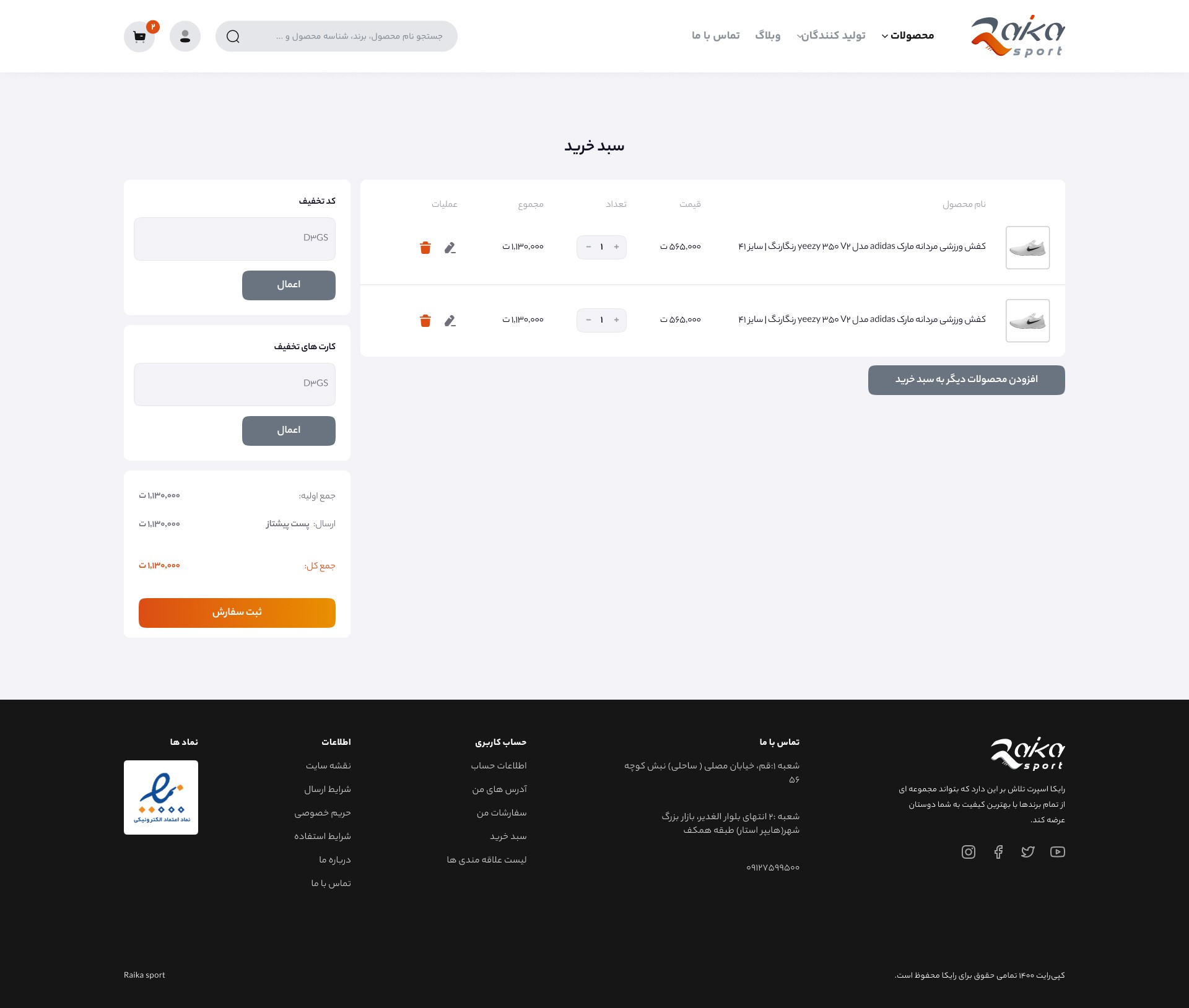
  • Designed an efficient and reassuring checkout process.

  • Ensured a responsive design, optimizing for both desktop and mobile users.

Information Architecture

The information architecture was designed to facilitate ease of navigation, allowing users to intuitively browse categories, find specific products, and make purchases without any confusion.

  • Logical categorization of sneakers by brand, type, and size.

  • Easy-to-access shopping cart and user account pages.

  • Clear visual hierarchy on product pages, with emphasis on call-to-action buttons.

  • Quick links to policies, customer service, and social media integrated into the layout.

Value of the Project

For users, the value of the Raika Sport online store was multifold:

  • A broad selection of sneakers, with detailed descriptions and imagery.

  • A streamlined shopping experience from search to checkout.

  • Time saved by quick and efficient navigation.

  • Confidence in purchases through detailed product information.

For Raika Sport, the e-commerce platform represented:

  • Increased reach beyond the physical store location.

  • Enhanced brand presence and reputation online.

  • Higher sales volume through an optimized online sales funnel.

  • Ability to track user behavior and preferences for future improvements.

The Design

The Design

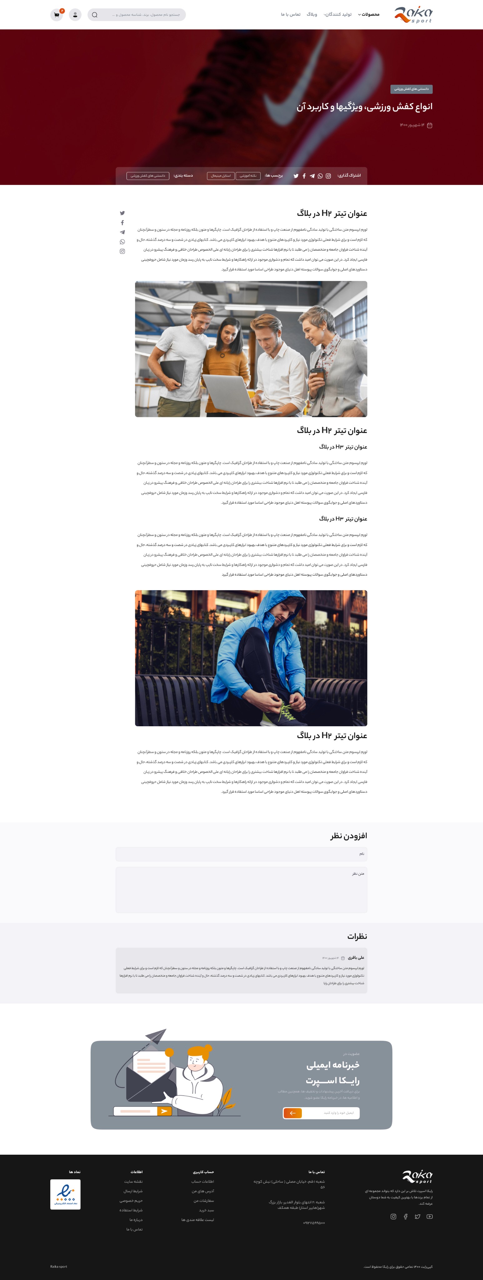
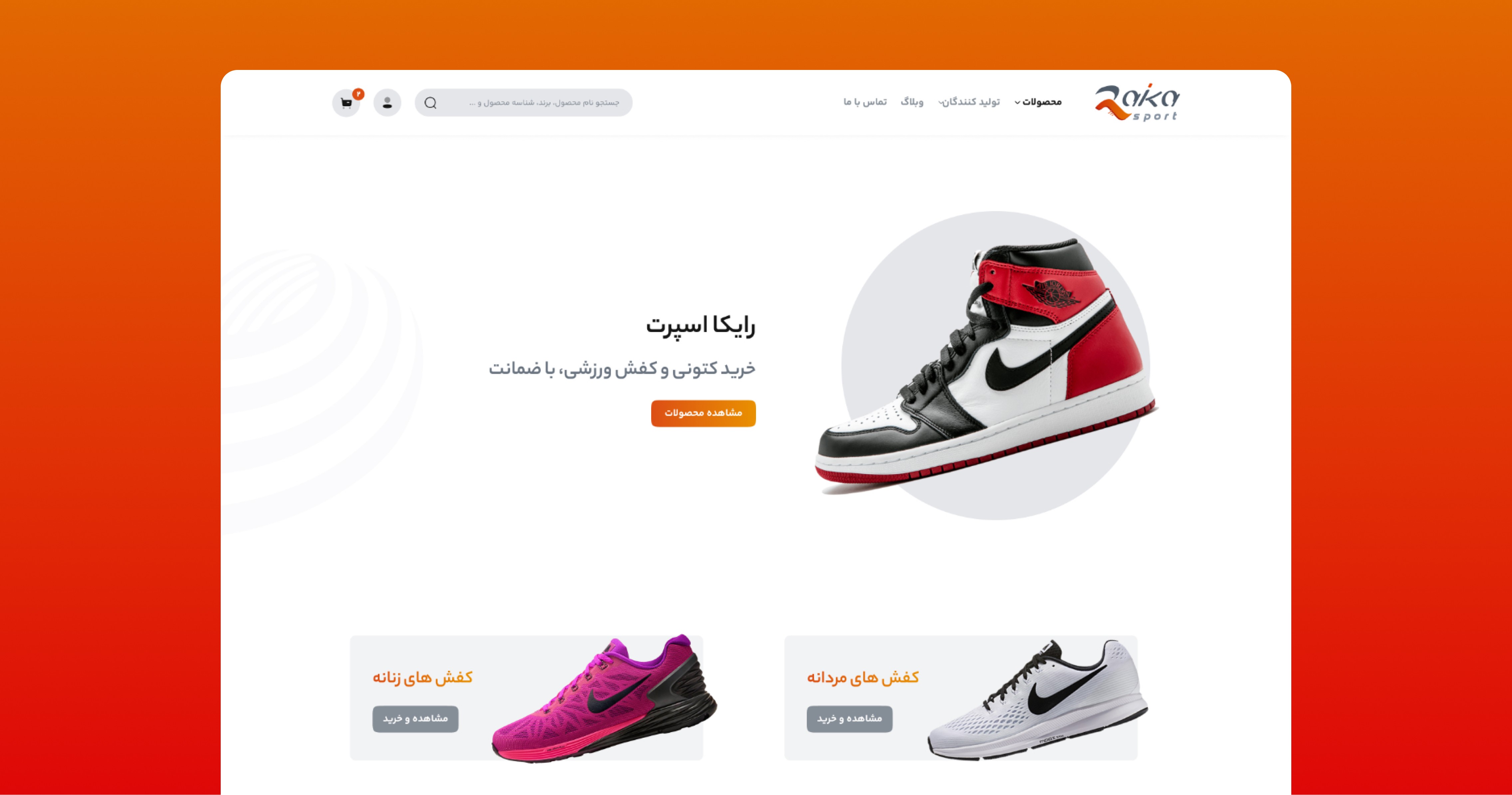
The UI design capitalized on a component-based approach, where reusable elements ensured consistency throughout the platform. A color palette was chosen to reflect the vibrancy and dynamism of the sneaker culture, while typography was selected for clarity and readability. The grid system facilitated a structured layout, making it adaptable across various screen sizes.

Conclusion

Conclusion

The Raika Sport online sneaker store project was a comprehensive exercise in creating a user-centered e-commerce platform. The component-based approach not only streamlined the development process but also ensured a cohesive user interface. Wireframing was a crucial step that provided a solid foundation for the design, enabling a focus on usability and aesthetics.

The outcome of this project was a sleek, modern online store that appeals to sneaker enthusiasts. It supports the brand's image as a leader in the sports footwear market. The success of the project is measurable in the increased user engagement, higher conversion rates, and positive customer feedback. Overall, the project has set a benchmark for future e-commerce ventures for Raika Sport, demonstrating the power of a user-first approach in digital retail.
Let's Create Amazing Experiences Together

Let's Create Amazing Experiences Together

Let's Create Amazing Experiences Together

Schedule a call with Ali Bagheri.

Schedule a call with Ali Bagheri.

Think I’d be a good fit for your team or project? Let’s connect.

bagheriux1@gmail.com

Email copied!

Ali bagheri – 2024©

Think I’d be a good fit for your team or project? Let’s connect.

bagheriux1@gmail.com

Email copied!

Ali bagheri – 2024©

Think I’d be a good fit for your team or project? Let’s connect.

bagheriux1@gmail.com

Email copied!

Ali bagheri – 2024©